Shedd — Dubizzle / OLX Group
Brand, design system, and end-to-end mobile UX for a women's preloved-fashion marketplace.
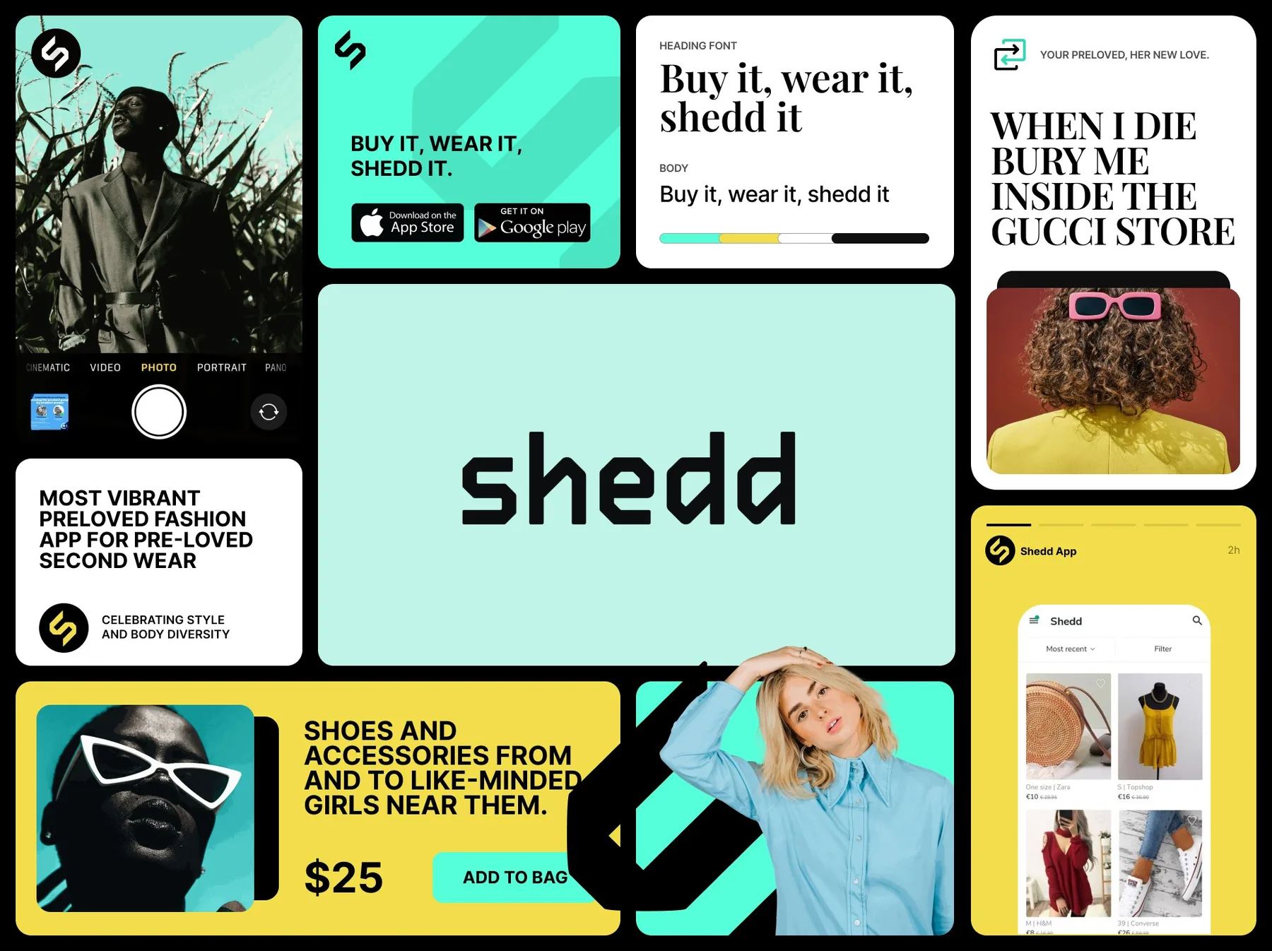
Designed and shipped Shedd — the OLX Group preloved fashion marketplace — from brand identity through the atomic design pattern library through a measured set of UX experiments that drove a 40.1% install conversion rate (9.5k installs from 23,674 social clicks) and a 2× lift in product-page conversion from the new "More from this seller" sections. Live across seven markets at launch.
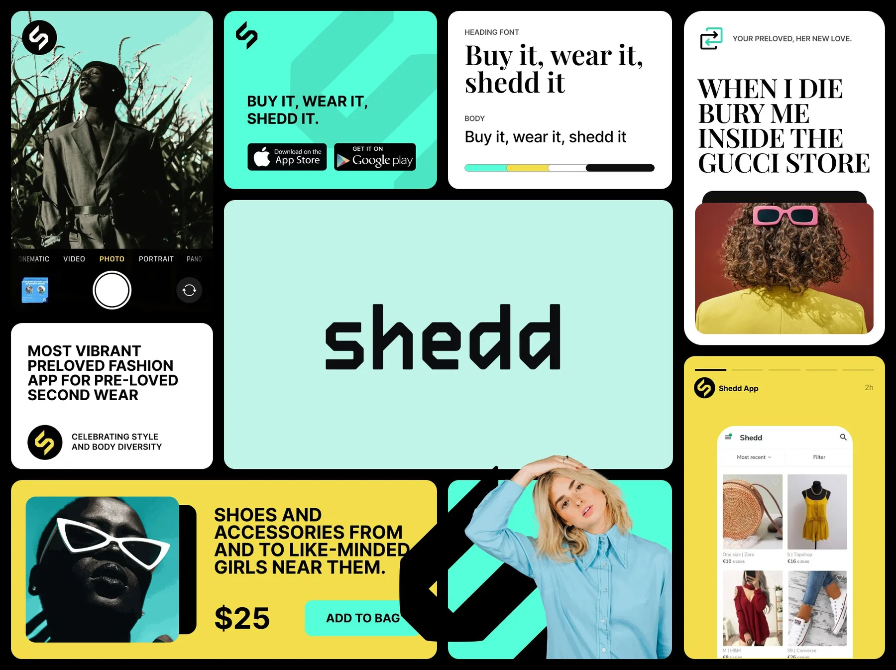

A women’s preloved-fashion marketplace inside the Dubizzle / OLX Group portfolio. My role: the atomic pattern library, the brand identity, and the end-to-end mobile UX. Live across Spain, Bulgaria, Romania, the UAE, Portugal, Colombia, and Australia.
The Constraint
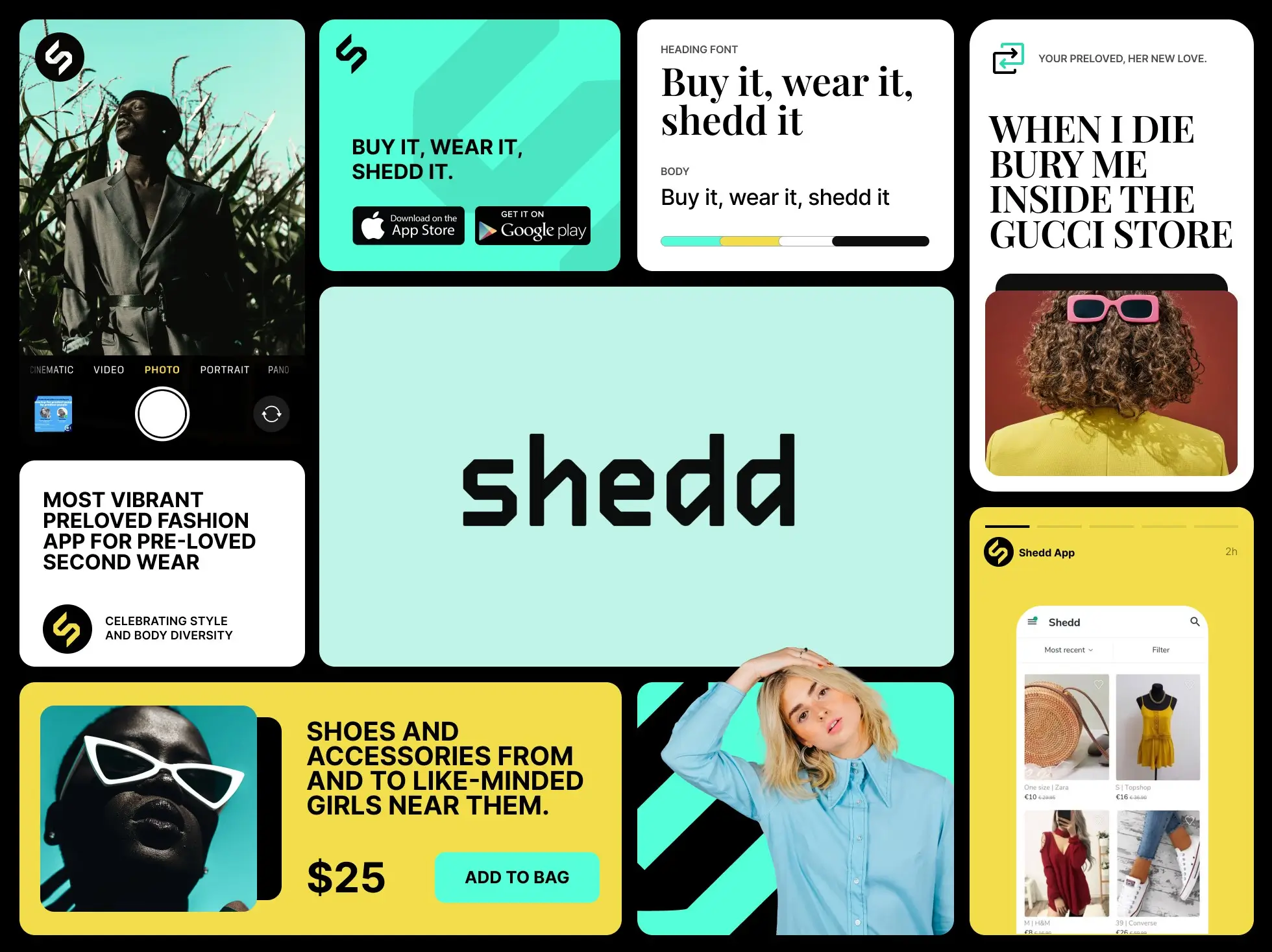
Introduce the most vibrant preloved-fashion app on the market. Celebrate style and body diversity. Encourage consumers to reduce fashion waste by buying and selling clothes, shoes, and accessories from like-minded women near them. Shedd’s purpose: make better use of the world’s possessions.
A startup women’s marketplace differentiating from classifieds with built-in pick-up and delivery between seller and buyer — across seven markets at launch.

The System I Introduced
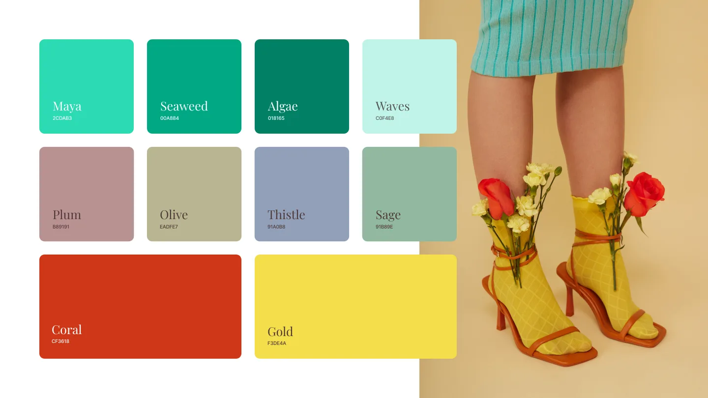
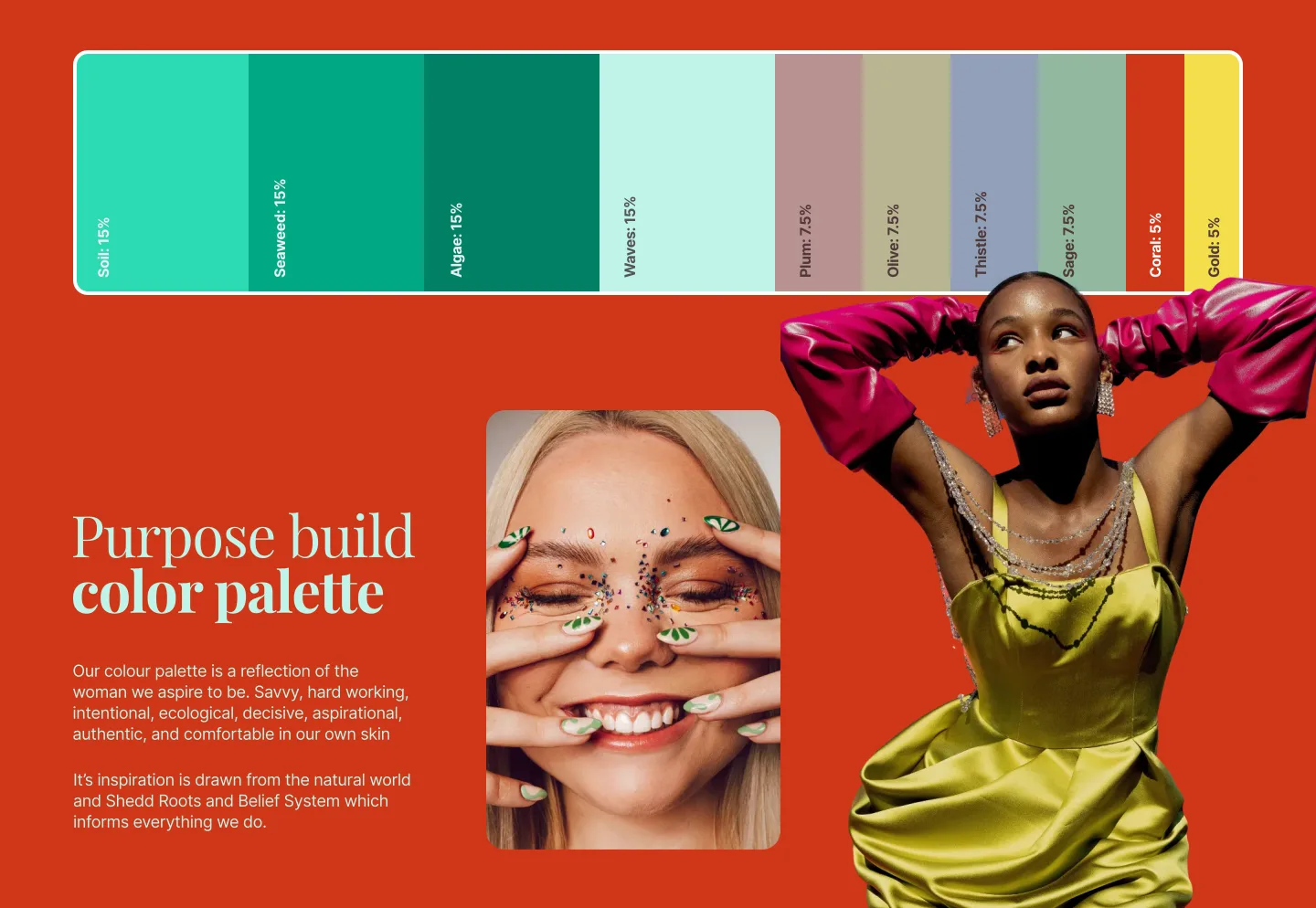
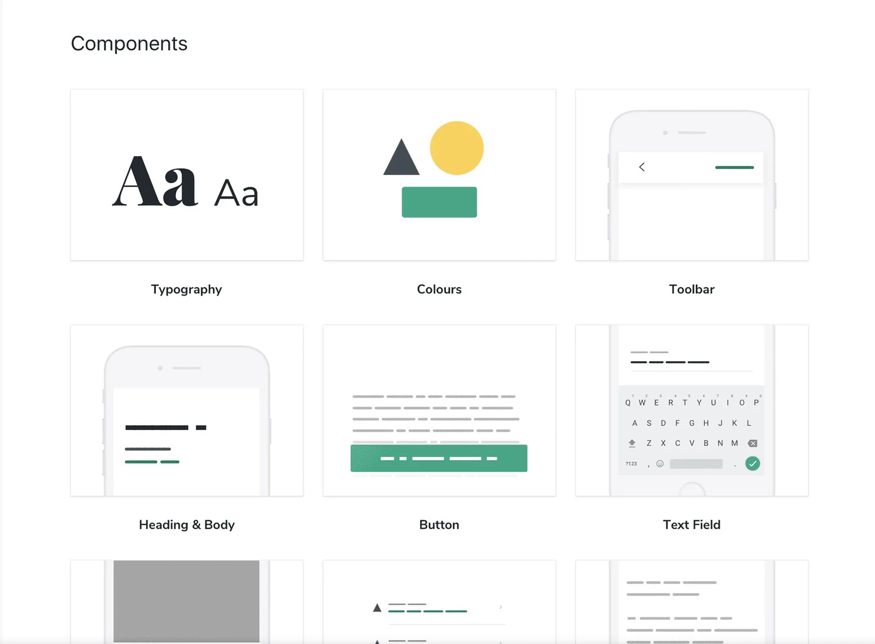
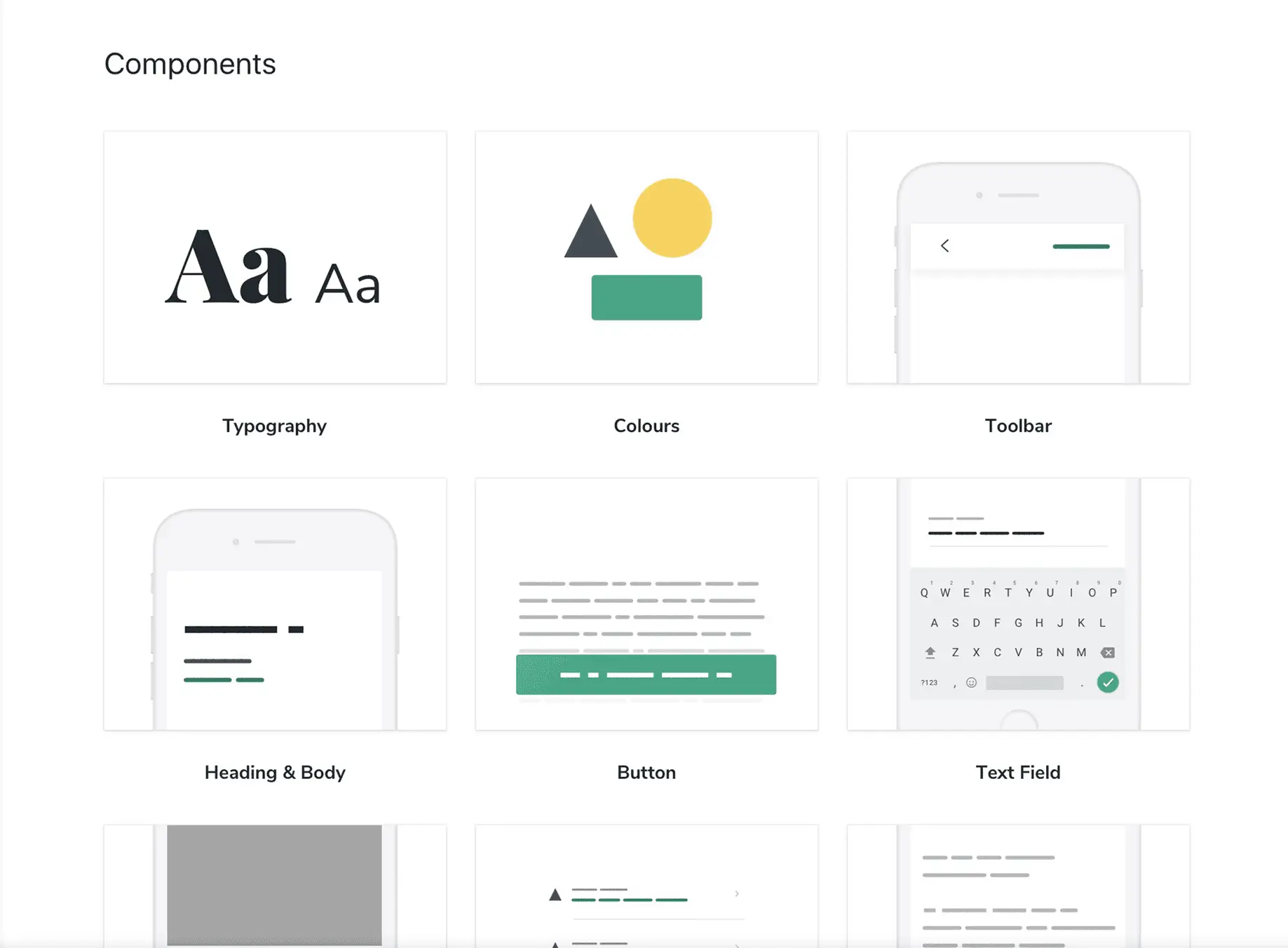
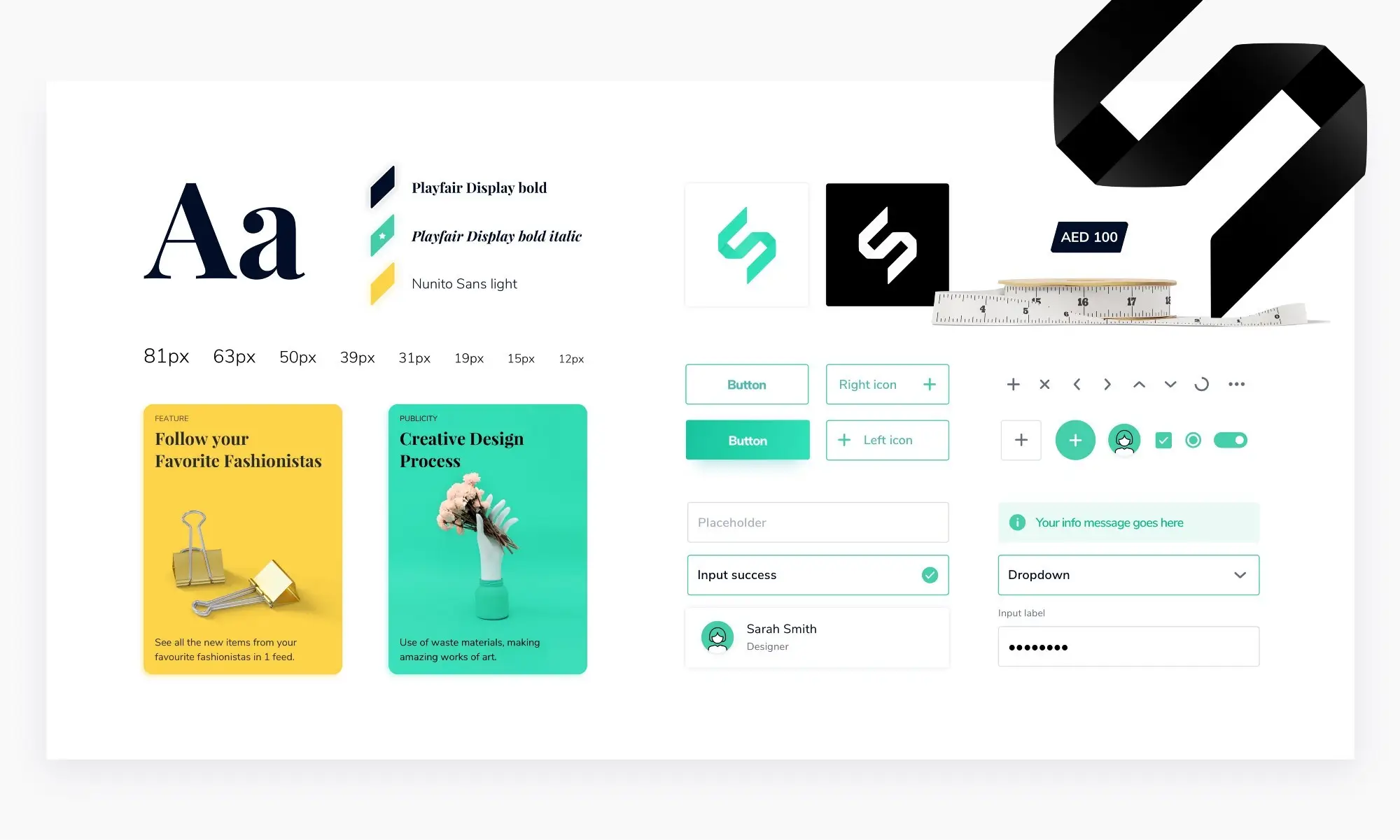
Shedd needed modular building: a pattern library, a style guide, and a design system aligned to a shared vision of brand voice, visual style, and behavior. To reimagine the brand, every team member was asked: “If Shedd were a person, what would her personality be like?” Six strong points surfaced — accessible, feminine, fun, vibrant, unique, humble.
I delivered the full atomic pattern library after a 4-day sprint workshop on transferring brand values into a living style guide. The Shedd character sat on top of it — making the system speak in the brand’s voice, not just look like it.
Key Decisions
Use funnel metrics to choose what to redesign
Context: A startup with a small team can’t redesign everything. We needed a defensible way to pick the interaction with the highest leverage.
Choice: CUPID — a usage-metrics framework that surfaces “which steps are always required to complete this selling process?” That pointed straight at the seller flow and the listing feed as the highest-impact targets.
Trade-off: Required reliable analytics instrumentation before any design work could start. The investment in event tracking paid for itself the first time we A/B-tested with confidence.
Surface decision data on the feed, not the detail page
Context: Listing pages traditionally drive shoppers to the product detail page (PDP) to see size, brand, and price. That’s an extra navigation step every time.
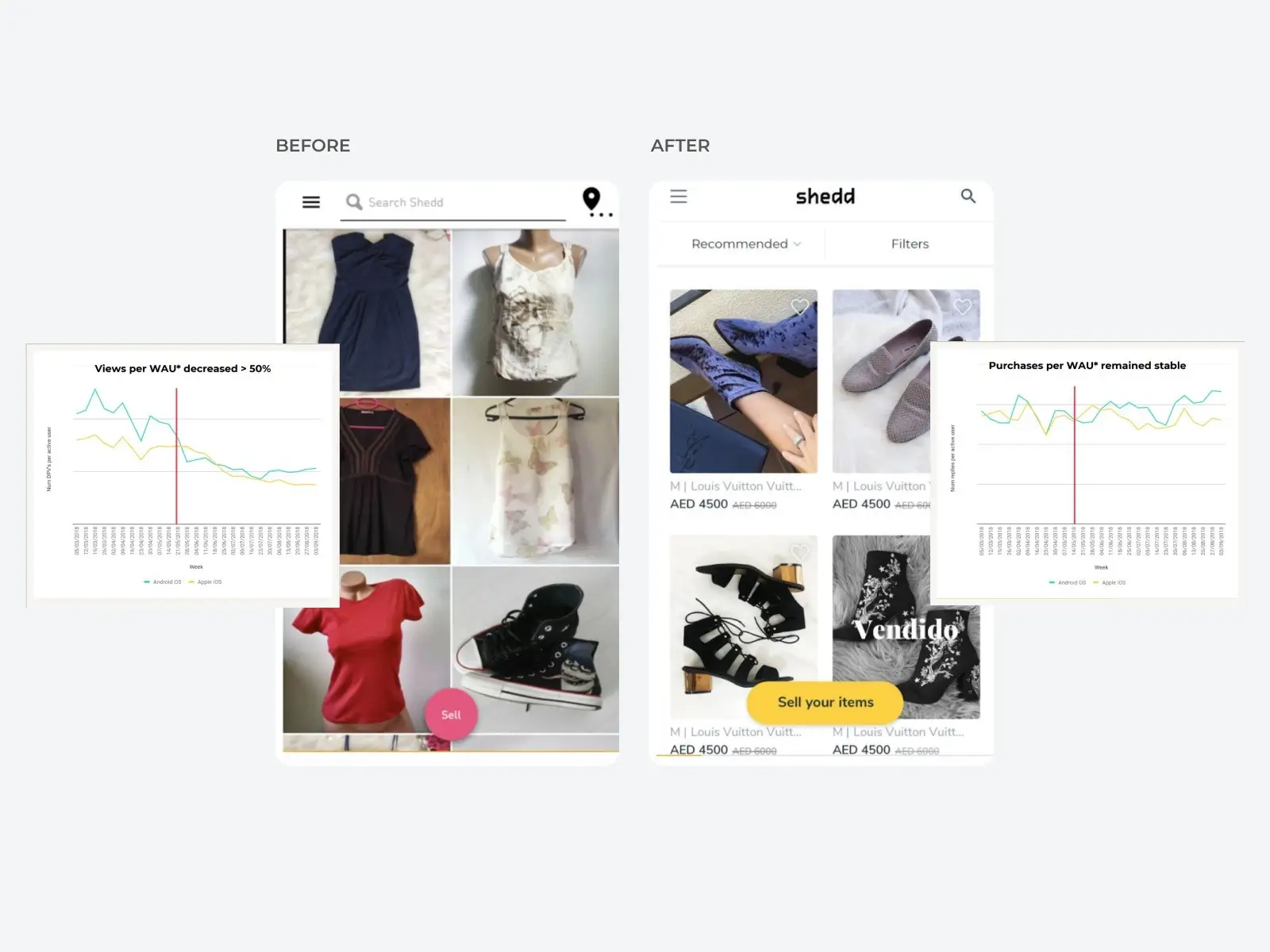
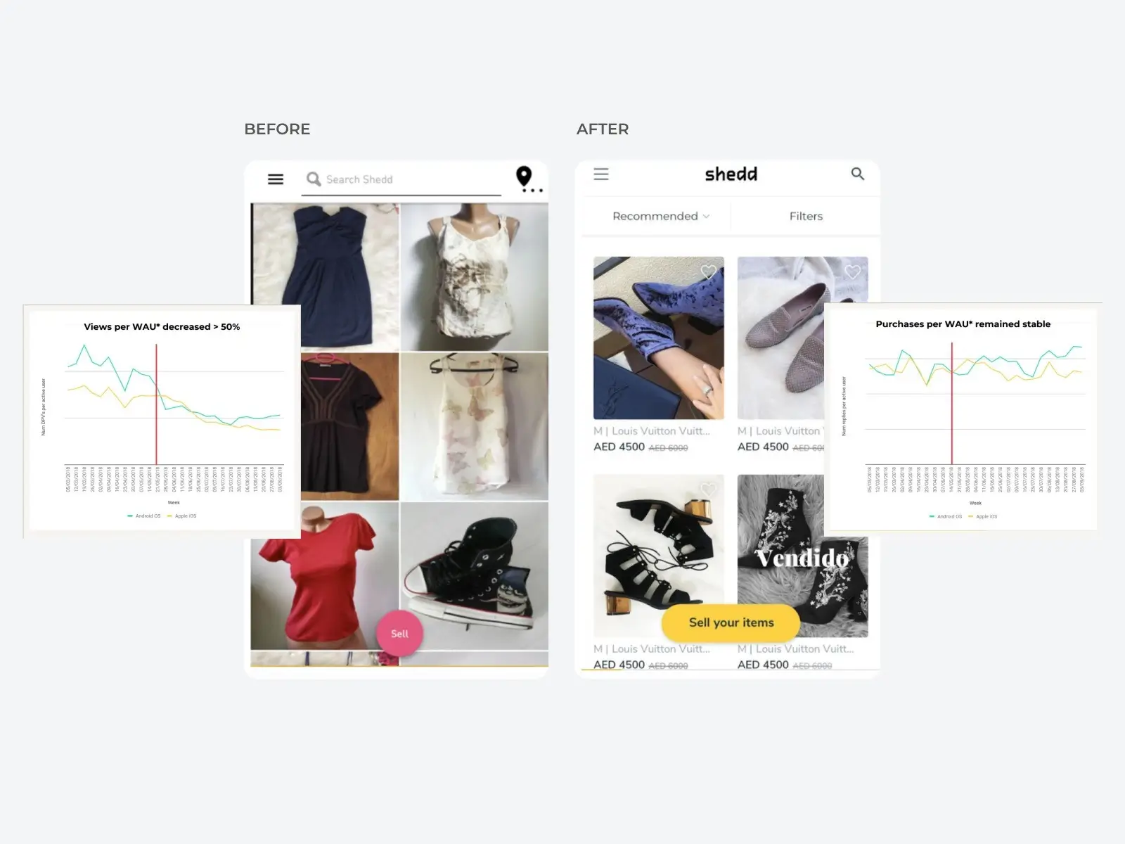
Choice: Added size, brand, asking price, and add-to-favorites directly to the listing feed. The hypothesis: reduce detail-page views without reducing purchase intent.
Trade-off: Risk of cluttering the feed visually. Mitigated through a controlled A/B test — the new feed showed fewer DPVs with stable purchase-intent conversion. Less navigation, same outcome.
Make the product page profile-driven
Context: Analytics showed a significant traffic source to the PDP came from the seller’s profile, which was hard to navigate.
Choice: Rebuilt the PDP around the seller: number of followers, items for sale, quick navigation to other listings, and “More from this seller” + “Customers who viewed this also viewed” sections.
Trade-off: Higher development cost for a high-risk surface. Rolled out via A/B test with an extensive control group. The “More from this seller” section ended up 2× more likely to convert than any other PDP traffic source.
Inline feedback during the task, not after
Context: Post-task surveys collect feedback long after the friction was felt. The signal degrades with every minute.
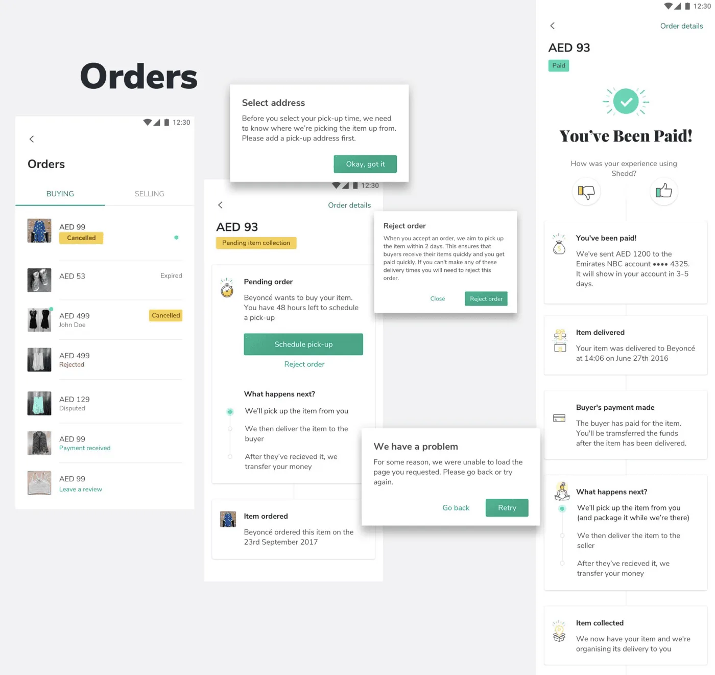
Choice: Thumbs-up / thumbs-down feedback at each step of the seller-paid flow — combined with first-look testing — gave a more complete picture of effort and friction at a fraction of the cost of a usability study.
Trade-off: Required clear copy and visible status to avoid noise. Once tuned, it became the primary signal for iterating on the flow.
How the System Changed the Work
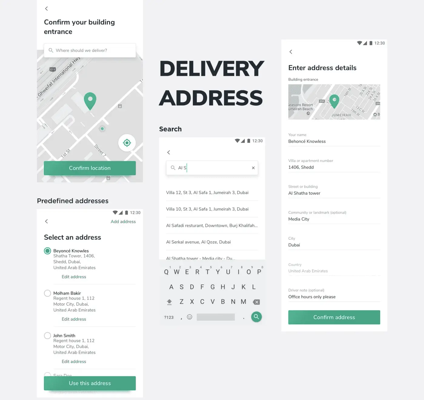
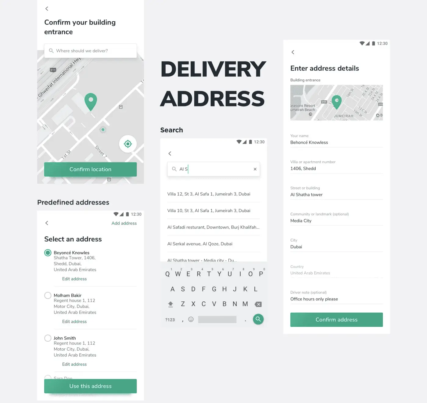
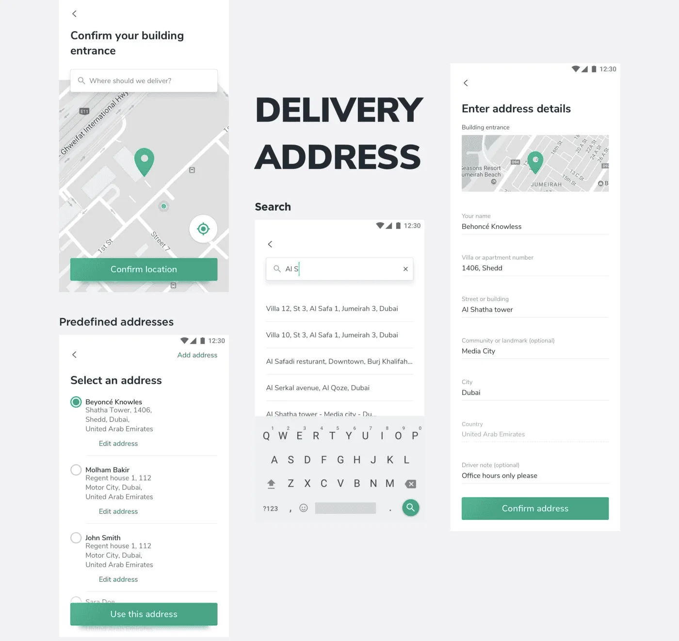
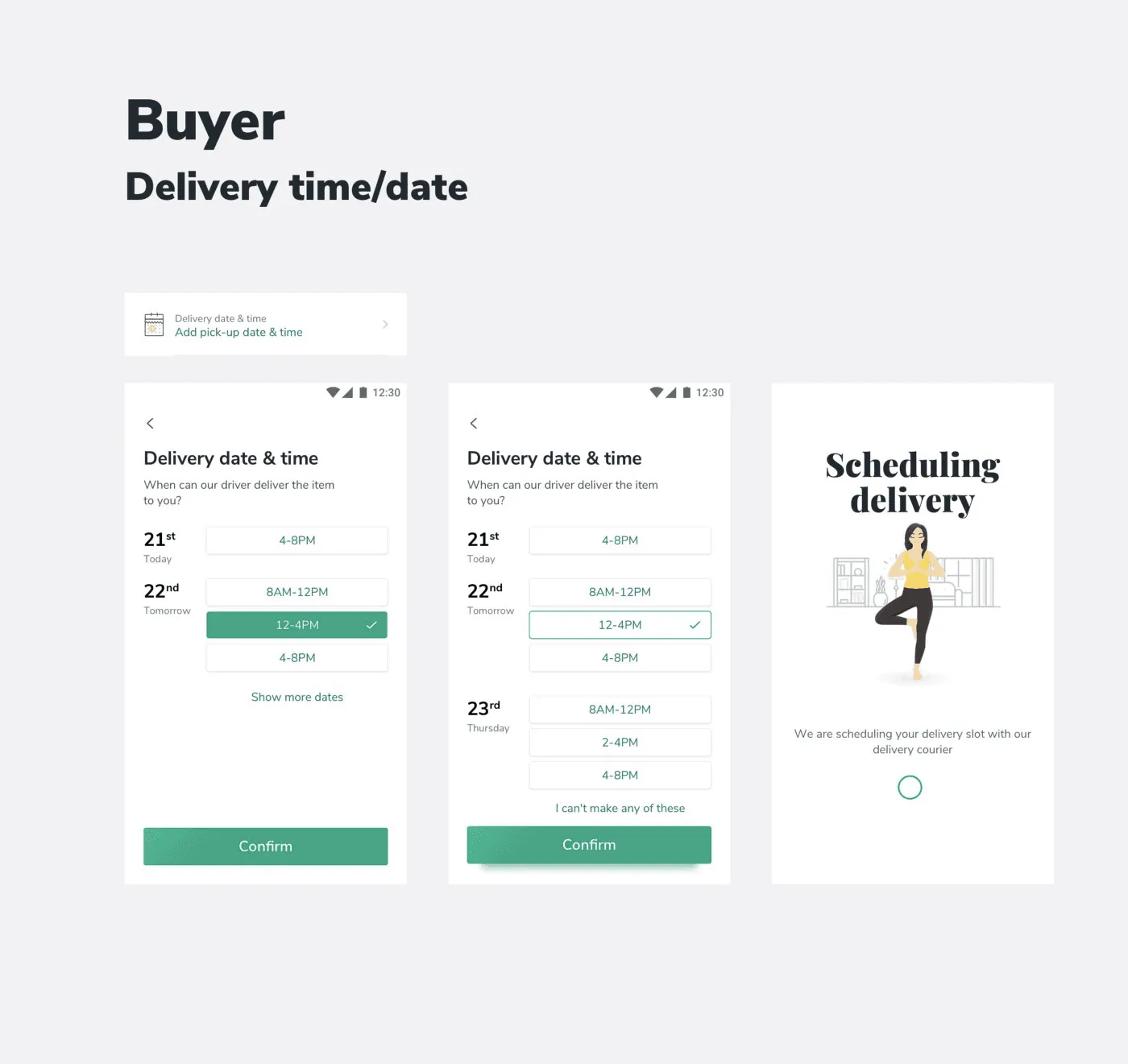
A complete atomic design pattern library shipped to the team as a living InVision artifact. A documented brand identity and set of design principles co-created with the product team in a 4-day sprint workshop. An end-to-end mobile UX covering onboarding, listing feed, PDP, seller flow, and bottom-sheet patterns — all measured, all A/B tested where appropriate.
Measured Result
By the numbers: 9,500 app installs from social media (23,674 clicks at a 40.1% install conversion rate). 2× lift in product-page conversion from the new “More from this seller” sections. Reduced detail-page views with stable purchase intent — less navigation, same business outcome. Live across seven markets at launch: Spain, Bulgaria, Romania, the UAE, Portugal, Colombia, Australia.

What I'd Do Differently
The atomic design library was thorough but lived in InVision — a tool that's now sunset. If I were rebuilding this today I'd ship the system as code-backed Figma variables with a Storybook playground from week one, so the design system and the production codebase share one source of truth and survive any specific tool's lifecycle.
What's Next
The core insight — fewer detail-page views with stable conversion is a win — holds across every classifieds-style marketplace I've worked on since. The CUPID metrics framework + small high-confidence A/B tests on high-traffic surfaces is now my default playbook for product redesign work, regardless of vertical.


Let's talk about your project.
Bouguessa